Composing Outdoor Studies: Framing, Scale, and Negative Space
Composition is a decision-making map
Even small studies require decisions about what to include, what to leave out, and where to place the main forms. Composition is less about rules and more about controlled omission and emphasis. For field work these decisions must be quick and grounded in what will best communicate the scene on a small page.
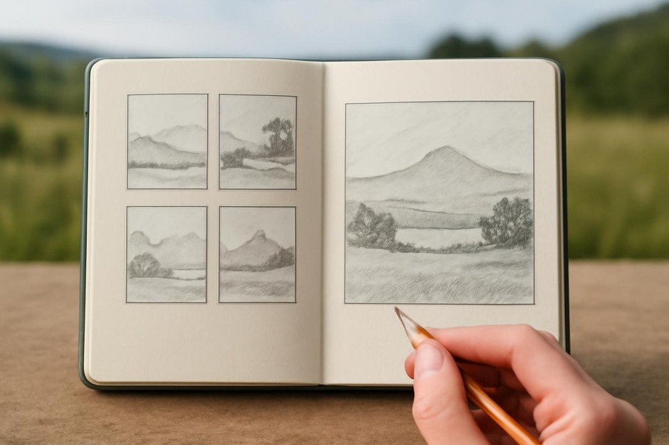
Start with thumbnails
Thumbnails are the quickest compositional tool. Draw several tiny rectangles and sketch the main value masses and focal points in each. Test horizontal, vertical, and tight-crop versions to see how scale and edge-relationships change the focus of the study.
Framing choices
- Tight crop Use when the texture or detail is the subject. Restricting context pushes viewers into surface or pattern study.
- Medium frame Shows part of an object within environment, useful for describing relationships such as a branch crossing a sky patch or moss on a rock ledge.
- Wide frame Communicates place and atmosphere but requires simplified shapes and strong value organization to remain legible at small scale.
Scale and proportion
Decide whether your study will prioritize accurate proportion or expressive emphasis. For scientific recording, maintain scale cues such as known objects or labelled ticks. For expressive studies, exaggerate sizes to lead the eye—make the key element slightly larger or set against ample negative space for emphasis.
Negative space as an active element
Negative space organizes the composition as much as positive forms. Use empty areas to rest the eye and to define silhouettes. In field studies leave deliberate unpainted areas to signal bright light or reflective surfaces. Negative space can balance a dense textured area and create rhythm across the page.
Value-first thinking
On small pages value often contributes more to readability than colour or line. Begin with a value sketch to establish major lights and darks. Place your darkest dark and your lightest light before detailing. Clear value structure helps preserve depth and clarity after you add texture or colour.
Anchors and pathways
Create compositional anchors such as a dark trunk or a large rock. Then identify a visual pathway that leads the eye—a branch curve, a light strip, or successive value contrasts. Pathways can be subtle but keep the viewer moving within the frame rather than escaping the page.
Edge control and finish
Edges matter outdoors. Hard edges attract attention; soft edges suggest atmosphere or distance. Use finer tools for edges you want to read crisply and broader washes or lifted paint for soft transitions. A finished page often combines both: crisp foreground textures against a soft, suggestive background.
Practice exercises
- Create a set of twelve thumbnail studies of the same scene at different crops and choose the strongest three for larger studies.
- Do a negative-space exercise where you draw only the shapes of emptiness, then invert the image mentally to see how forms emerge.
- Time-constrained compositions: twenty minutes for a medium frame, five minutes for a tight texture study. Compare legibility and focus.
Compositional skill grows through repeated choice. The more you practice framing, scaling, and using negative space in short sessions, the faster you will see the essential structure of a scene and make decisions that yield clear, communicative pages.